“My client’s mention gets chopped in half! What the f***”
“..Screenshots in the online view are a bit blurry and the text is hard to read. What’s the point?”
That’s just two of my favourite colourful comments about the sharable online view of our reports. Clearly we had work to do.
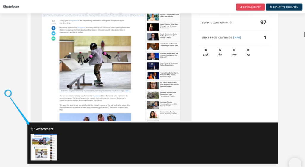
Behind the scenes we already automatically capture full screen grabs of your coverage. But then we chop and squeeze that image into the online report template you’re familiar with. Which accounts for about 60% of the page.
Which now I think about it seems like a very silly thing to do. Great for highlights and browsing but rubbish if you want to view the thing in full.
If only we provided access to all these full screen quality captures eh?!
Well. From today you’ll notice a small tweak to format of online reports.
Below every coverage summary image you’ll see a thumbnail(s) representing an attachment. Each thumbnail now links through to a full size capture attachment of that page. This also works for all other types of coverage you add yourself. Like PDF, image, doc imports etc.

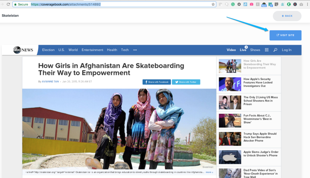
When you click through you’ll now see a full screen capture of that image.
See an example full screen capture here: https://coveragebook.com/attachments/514892
Great if you want to share & read through in more detail and in all it’s glory from the main report. Check out a full report here >>
And don’t worry. The links to the full live article are still intact. From the capture you or your report reader can go view the page as it is now.
