She said that’s ok. I don’t need your insight.

Ok baby do what you please.
I have the metrics that you want
I am the thing that you need
The client looked me deep in the eyes
They say there’s no turning back
How can you plan your next thing
They said they’re not coming back
Because he’s distrusting of me…
Dirty Data, nah
Dirty Data, nah
Dirty Daaa — — taa, nah
Who knew MJ was so knowledgable in PR data and insights?
Well now we have the soundtrack we need to take the topic seriously because, yes, clean PR data is ‘a thing’!
Coverage Trackers
Data comes into all areas of Public Relations however coverage trackers are arguably the most important recordings of data. It holds the findings of all activity.
I’m sure you are familiar with these lists, perhaps you collate them yourself or your team report progress and achievement to you in this way. It can be a simple lists of coverage, noting details such as headline, date, source name, URL, campaign name, media type (national / regional trade).
Have you ever thought about whether your tracker data is clean and actually usable for insights?
Coverage clip and media analyst Steph Bridgman. She knows all too well how coverage trackers can go wrong. Steph’s team at Experienced Media Analysts measure thousands of coverage clips each week to draw insights. If there is just one clip with the wrong data the whole campaign measurement can be incorrect!

Understand the meaning of the data provided by your monitoring provider
For Steph Bridgman, having the right data is whether she can carry out her job successfully or not. As a media analyst, clean data enables efficient insight generation. Steph analyses thousands of pieces of coverage every week and she know that with just one incorrect input the whole tracker can turn into a useless document for drawing insights.
Steph share’s an example;
“I had a PR agency client that was regularly updating a coverage clip tracker. They would use one ‘reach figure’ from one monitoring provider but would then take another ‘reach figure’ from another source.
One of these providers reported on online reach in terms of ‘potential daily reach’ whereas the second provided monthly audience figures for the same high-profile news website.
This is a small difference in label but a huge difference in meaning. The figures were like chalk and cheese — The second figure gave the stats for the whole site. The other figure was 30 times higher!
Sense check your data sources, just one entry in a list of 500 items of coverage can completely skew your measurement and insights”
Here Steph Bridgman shares 7 tips on how to clean up your data:
1.Choose Excel over Word to make your list.
Excel allows you to chop up categories of data into rows and columns which can be cross referenced and dissected later using pivot tables. List each new item in new rows. Break your coverage up into categories, which are noted per column — these columns could be anything relevant to your client, PR objectives or campaign: headline, date, source name, journalist name, spokesperson featured, product featured, potential audience reached, Domain Authority score, number of social shares.

By placing your data neatly into these rows and columns, it makes it much easier for example to answer questions such as:
- ‘How many of our articles featured the brand name in the headline over the past quarter?’
- ‘What was the average domain authority of our online content last year and has it improved over the previous year?’
- ‘which journalists are producing national press content for us?’.
2.Be consistent in your categorisation.
For example, you may be tagging against a range of media types such as ‘national’ ‘regional’ ‘trade’ and ‘broadcast’. If this is the case, be sure to only use these four descriptions in your media type table — copy and pasting can be useful here.
Don’t be tempted to enter a random description in your media type category, it makes for messy data later.
Each source name will belong to a media type — for example, Daily Mail = national, Manchester Evening News = regional. Simples! But if you have multiple people working on the PR data, are they being consistent in their categorisation? Did one person class The Scotsman as a national paper, another person classed this as a regional title? Was The Wall Street Journal categorised as an international title or a national newspaper?
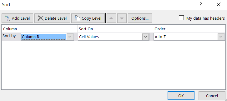
One way to consistently apply the same media type to the same publication names over time is to sort your Excel by source name when checking the data, and possibly doing this categorisation in one batch at the end of a piece of work, rather than expecting the analyst(s) to categorise consistently. This comes from the principle that ‘the media type links to the source name’ rather than ‘the media type links to the article’.


This also rings true when you are logging audience figures for example — did you log the same audience figure for those two items in The Sun or did you miss a digit off the end? This can seriously impact your reach.
3.Is your column a number field or a text field?
Insert the right types of characters into the right columns. If you have a DA column for example, simply enter the number in the box, no need to write DA: 73 in the box. This makes it easier to work out an average DA score from a long list of online coverage at the end of your analysis period.
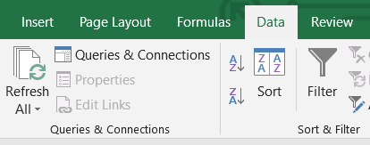
Clean number fields can be placed in ascending or descending order using the ‘sort and filter’ function in Excel, allowing you to easily see for example which of your items had the strongest reach, or generated the most social shares. You can also use the ‘conditional formatting’ function to highlight which were the top 3 or top 10 highest or lowest values in a particular column for example.
4.Are there gaps in your data?
Sometimes we just can’t find a readership figure when we need one and we leave it blank to come back to it later. You can use conditional formatting and rules in Excel to highlight blank fields which need completing later.
5.Are there duplicates in your data?
Excel has a clever button for this, did you know it existed?

6.Did you log the URL of the piece?
This may seem like an obvious thing to point out, but with the increasing importance of online content over print, not just for social amplification but also for SEO and long tail impact, does your PR data include a log of the URL itself?
This is important because you may choose to add a new content metric later and need to check back at the content.
Perhaps as an account manager you may need to check the integrity of your account team’s admin. Keeping the URL next to the coverage log saves a lot of time when checking or amending data.
Perhaps you log social shares of your content. But these figures change over time — you’ll notice that if you email a client about social shares today, the number may be different next week. That’s why it is useful to have kept a log of the URL, much more useful than static screen shot. You can check back for the latest figure.
7.Keep the data consistent by using one tool/data source
It’s easier to keep trackers and data clean by automating data from one source. CoverageBook could be helpful here. You can download CSV files of clip data including traffic, domain authority and social shares which means you can remove the danger of human error.
Following my seven tips will help you data clean and your insights rich. Share this with everyone involved in keeping track of clips because without it you may not be able to measure your success at all.
Is it time you tidied up your PR data?
Watch the dirty data webinar
Join me, your host Stella Bayles, director of CoverageBook & author of PRs’ Digital Resolution along with tips from PR measurement and media analyst Steph Bridgman.
In this 55 minute webinar you’ll learn:
– What dirty data is & how to clean it up
– How to organise your tracker
– How to uncover golden insights
– How to use excel & tools to save you time