If you are compiling annual reports and thinking about setting targets or KPIs for 2025, our new coverage benchmarking report based on six million URLs uploaded to CoverageBook in 2024 will be really interesting. After all, a KPI should ideally be specific, measurable, achievable, realistic and timebound (SMART) – so why not use some of the data below to see how you measure up?
How do your results compare with ‘the trend’?
Is your average DA score good?
Are your social shares comparable with other organisations?
When you can provide more context, the data points become richer – your stakeholders will more likely recall that your team performed considerably better than others on audience and engagement than they will remember the specific numbers you shared with them.
‘Performance above benchmark’ is the key message or out-take they will get from you sharing this contextual data with them.
So, what does ‘performance above benchmark’ mean? It seemed timely to revisit the data we shared with you in 2020 and explore how things have evolved.
We’ll cut to the chase and provide you the nuggets and findings first; if you want to know more about how we approached this task, please scroll to the bottom of this post.
Key takeaways
- A tenfold increase in coverage achieved in very high DA sites (>90) – representing 15% of news URLs uploaded in 2024, up from 1.5% in 2020.
- It is normal not to get social shares – 66% of coverage didn’t.
- If your social shares are in double figures this places you in the top 19% of results.
- Because more and more users are uploading TikTok and Instagram URLs, this has nudged up the share of coverage receiving a high level of engagement (>1,000).
- People still love (or hate?) the Daily Mail’s sidebar of shame. When looking at results for this outlet in isolation, we see that the TV Showbiz section of the website produces the highest average social engagement, followed by News and Femail.
- Have you ever wondered what the impact was of the Daily Mail’s syndicated articles? The ‘wires’ segment of the site which carries newswire coverage generates no social shares at all. Is anyone actually reading it? This coverage is hard to find on the website.
How hard is it to get coverage on high Domain Authority outlets?
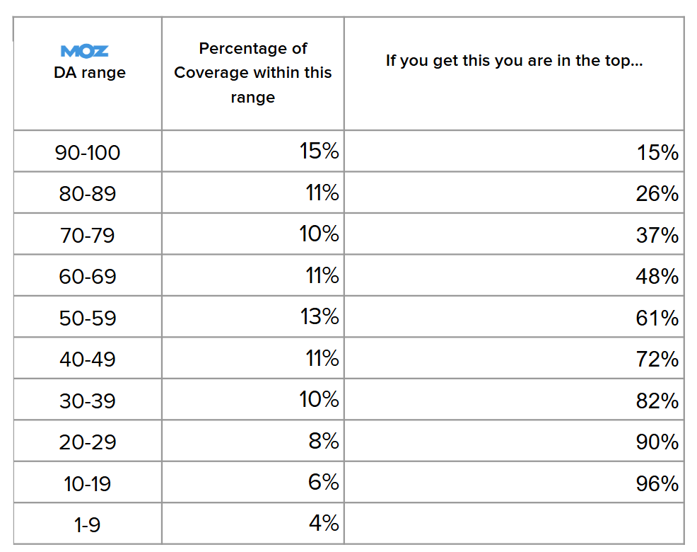
- When you get coverage on a site with a Domain Authority (DA) score of 90 or more, you’re within the top 15% of our users.
- High DA sites such as MSN, Yahoo!, Forbes and the Daily Mail, which all have a DA above 90 feature amongst our most prolific sources for the year.
- Beyond this, getting coverage on sites with a DA between 50-59 is most common – 13% of the coverage on our systems fell within this DA range.
- If your average DA score is 53, this places you in the top 61% of CoverageBook results – if your average DA score is 80, you would be performing in the top 26% of coverage submitted.
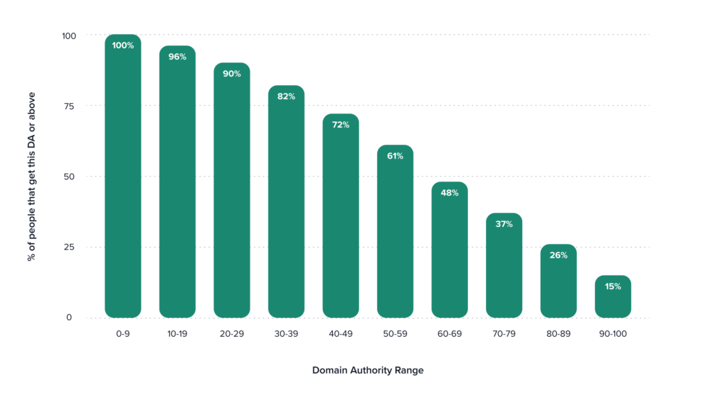
The full data:
How many social shares of my coverage is normal?
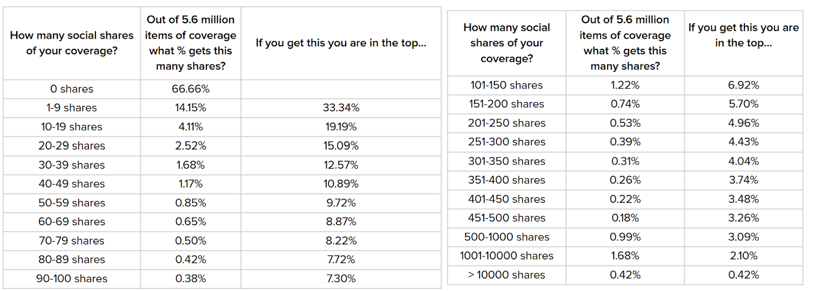
- Two thirds (66.7%) of all coverage was not shared publicly. In short: getting zero social shares is normal.
- Only 19.2% of coverage was shared 10 times or more.
- If your coverage received more than 100 social shares this places you among the top 7%.
- Increased use of Instagram and TikTok by our users has nudged up typical average social shares as engagement data is often higher for these social platforms than others – 2.1% of courage added to reports during 2024 had more than 1,000 social shares, up from 0.6% four years ago.
The full data on average social shares…
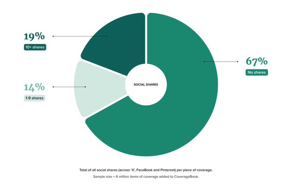
We hope this encourages you to compare your own data to give context to your results.
How have things changed since 2020? A ten-fold increase in >90 DA coverage
- There has been a tenfold increase in the share of users landing coverage in the highest (>90) DA sources – from 1.5% of coverage uploaded in 2020 to 15% in 2024.
- One reason for this could be the profile of CoverageBook’s user base; more customers are using our services including some of the world’s biggest brands and PR agencies.
- Another reason could be energy and attention has been shifted towards achieving high impact items, rather than focusing on quantity – in low impact or obscure outlets.
- Social sharing patterns remain broadly similar over time, and it is perfectly normal if no one shares your coverage- just a third of URLs uploaded to CoverageBook received any kind of social amplification.
- Only 19.2% of coverage was shared 10 times or more.
- If your coverage received more than 100 social shares this places you among the top 7%.
How we crunched the data
Here’s how we approached the task; we explored patterns across nearly six million entries on our database to understand what ‘good’ looks like. We looked at daily and monthly patterns to inform a year to date view of performance, allowing us to share these averages and benchmarks with you. We focused on the key quantitative metrics which our systems collate for you:
Domain Authority – a metric from Moz, rendered on a 100 point scale, you can find out more about Domain Authority here.
Estimated coverage views – audience information at an article level rather than site wide level. More information here.
Social shares – the total number of shares across open access user generated coverage platforms such as X, Facebook and Pinterest. Please note that our social shares data does not include LinkedIn.
Some housekeeping tips from CoverageBook
We had to make some exclusions from our calculations, and in doing so, we learned a little bit more about how some of you report on coverage using CoverageBook.
We excluded Google search results, Google Drive results and links to coverage which sit on other platforms such as Teams or media monitoring platforms – because these high domain authority sites were skewing the overall data returned. Anything with a DA of 95 or below were included in our calculations – for guidance, dailymail.co.uk has a DA of 94.
Benchmarking Tips from CoverageBook
- Make sure you are using the correct URL. We noticed a lot of links from Google search results, Google Drives or links to media monitoring platforms; we excluded them from this data as they would skew the findings. If you have these links in your report, your data will also be inaccurate.
- Make sure you save (and bill) enough time to analyse your reports. A CoverageBook report can be quick and easy to get out the door, but your insight about how this stacks up is invaluable.
- Use a mix of slides and metric cards to add this insight to your own reports.
- You can also use the Vault to download CSVs of your past campaigns and create your own benchmarks, which may be more specific to your sector or niche. You could do this at agency or brand level and measure how specific campaigns are performing.
- Take this another step further by looking at your best pieces and campaigns. Use the data not to only inform 2025 KPIs but also to brainstorm what content resonates the best with your key audiences, which will tell what you should be doing more of.
Interested in knowing how your coverage compares on popular sites? Read Part 2, Publication Benchmarks: How Does Your Coverage Compare?
